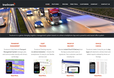
There are various options in TruckcomXT now available which allow you to customise how information is shown to you on the screen.
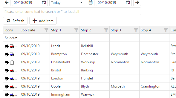
First, the software has light and dark themes. Light theme looks like this:
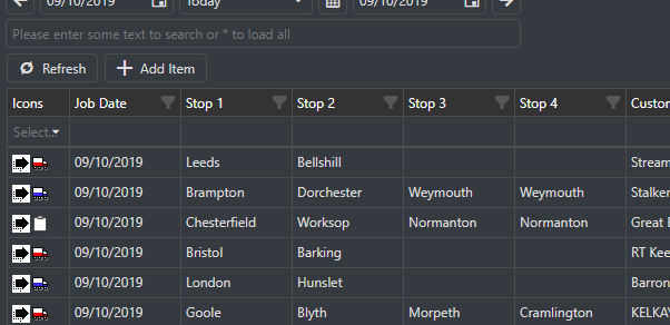
… and dark theme looks like this:
The way you choose which theme you want is via the menu at the top right with your user name:
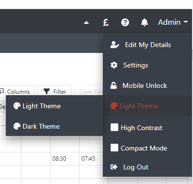
In the screenshot above, you’ll notice a couple of other things you can do to customise your view:
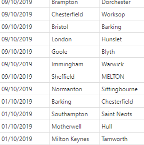
- There is a new “compact mode” which allows you to get more data on-screen. In compact mode, there’s less padding around the text in grids:
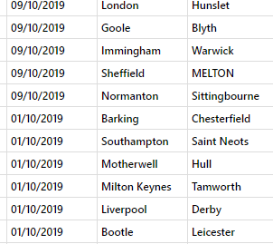
- There’s a new “High Contrast” mode which makes the text bolder against the background:
- And last but not least, you’ll notice a little upwards pointing arrow at the top right of the screen. If you hover over it, it turns red, and you get a hover message as shown below. Clicking on this minimises both menu bars at the top of the screen. This is another method of maximising the amount of useful information you can show on screen

When you click it, both menu bars collapse to a narrow black area across the top of the browser
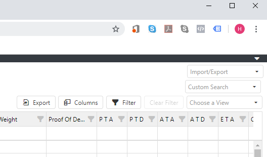
To get the toolbars back, you click on the small down-arrow at the top right of the collapsed bars.
A particular point to note is that the collapsed menu bars are very appropriate to use if you want to use separate browser tabs. To do this, for instance, in the Tracker tab, right click on the Jobs button in the menu and select “Open in new tab”
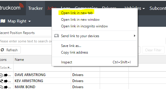
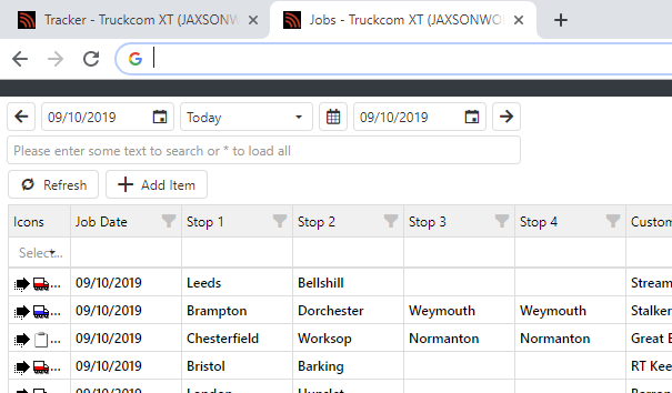
Then you will have two active tabs, one for the tracker, one for Jobs, which you can click between very quickly. Then you can collapse the menu bars in both tabs to maximise the amount of useful information on the screen:
We hope these view options will be helpful to users.


