Within Truckcom you are able to set up reports to show breakdowns of the data that is within your Truckcom system. There are many possibilities of report that you could create depending on what you are interested in seeing.
On the Reports tab you will see there are a number of default reports that we have created for you. These will be displayed with the Report Owner as Truckcom. You are able to customise these as required and save a copy of this as a new report. You can also create you own report from scratch if there is something specific you want to see.
Once a report has been created only the owner (the person who has created it) is able to edit it. They will be visible to all users of your Truckcom system but it will not be possible for them to change anything that has been set up.
There are a few different report visualisations you may wish to use, these are the options shown under Graph Type – Bar, Line & Pie as well as None (no visualisation just a data grid).
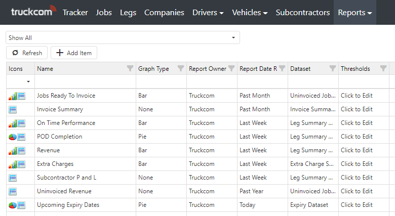
We will use one of these default reports to explain how you customise a report, the same principle can be applied to any report that has been created.
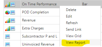
If you right click on the report row and select the option View Report a new tab will open up.
On this page you will see 3 areas. The top of the report will display the visualisation selected – in this case a bar chart.

Below this is at the bottom on the page is the report data grid. Here you will see the underlying data that makes up this report.
Similar to the other areas of Truckcom you are able to change the Date Range, enter Search Text or select a Custom Search to further filter the data displayed.
In this particular report we have nested rows, indicated by the arrow next to the row title. Clicking this will expand the Resource Group and show Resources within it and the data that is added up to create these totals.
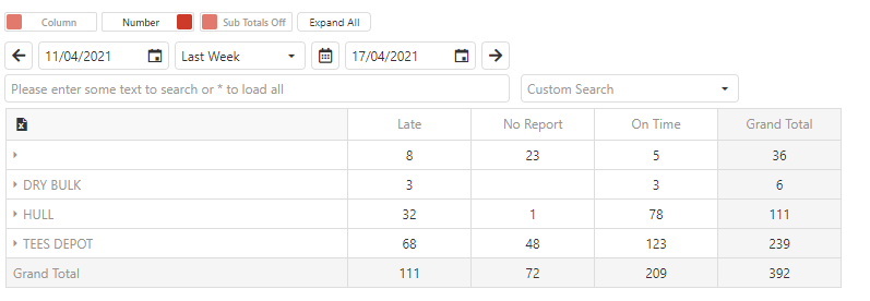
To the right of the screen are the field selectors. You will see all the available fields listed here in the All section. You can click and drag any of these as required to change the data that is displayed in this report.
The way these reports are structured is similar to that which you may be familiar with from an Excel pivot grid. You can specify Rows, Columns, Data and Filters as shown.
Any changes you make will update the report displayed on screen.
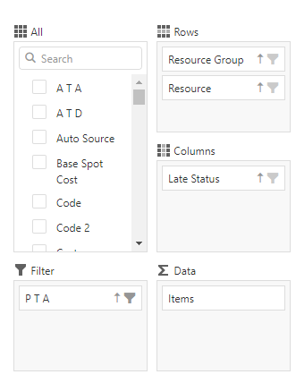
There are some more advanced settings you can apply to further manipulate the data that is displayed. For example clicking on the filter icon next to one of the fields allows you to apply a filter to it.
In this example only rows that have a PTA Present are included.
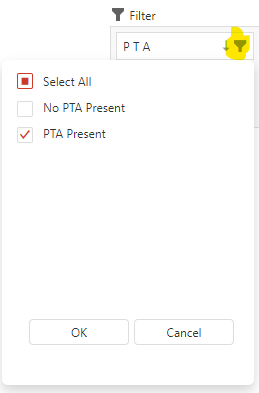
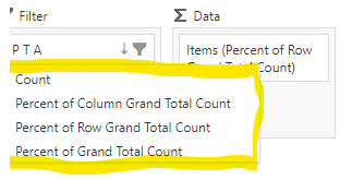
Also by right clicking on the Items field you are able to modify how the values are displayed. For example selecting Percent of Row Grand Total Count will change the data in the data grid from numbers to percentages.

At the bottom right of the screen are 3 buttons. You can
- Print the report (which will also allow you to save this as a PDF if required).
- Save the report (as described previously, you can only save reports which you have created)
- Save Report As – this will create a copy of the report which you will be the owner of, including any changes you have made.

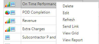
Back on the Reports grid, there are a few other options you can select when Right Clicking on a report row.
View Grid – this will open up a new page which will show you all the data included in this reports dataset. You can then view and filter this as you would the rest of the data within Truckcom.
Send Link – this allows you to send a link to this particular report page including all the filters that are in place when you saved the report.
